Modal
This will draw a popup element blocking interaction to the underlying page and optionally prompting the user for action.
A modal can be created using two ways, directly in your HTML or dynamically using JavaScript:
<dizmo-modal></dizmo-modal>
var modal = document.create('dizmo-modal')

// target should be a DOM node
target.append(modal)
This will just render an empty modal.
API
Passing data to the component
The API of the modal is similar to the modal in dizmoElements v1, which was actually called “dizmoElements notification”. It provides the same features but does not maintain the same interface. Given that this is a custom HTML element, all data is passed through attributes; there is no JavaScript API. Of course it is still possible to interact with the modal using the JavaScript DOM API, for example by changing the attribute or listening to an event. The following example shows all attributes that can be passed and will be rendered reactively:
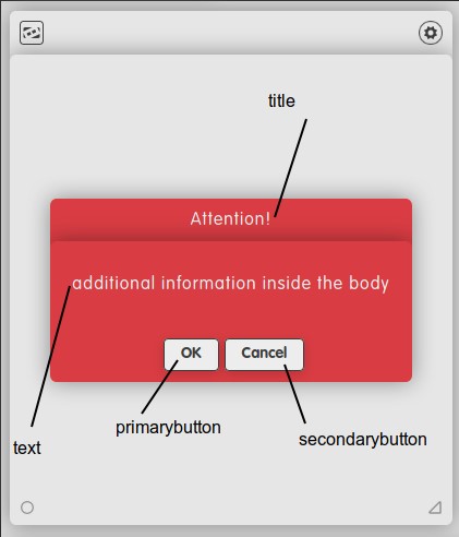
<dizmo-modal title="Attention!" text="additional information inside the body" primarybutton="OK" secondarybutton="Cancel" important>
</dizmo-modal>
This will render a red modal with the title attribute in the top header, the text in the main body that is scrollable if it exceeds the available space. Two buttons with text primarybutton respectively secondarybutton will be rendered. If the attribute is omitted no button is displayed. Since the important attribute is present the box is rendered in the –dizmo-color-red color. If this attribute is not present the modal will be shown in dark-grey. Using the example above we will get a modal rendered as follows:
Reading data from the component and interacting with it
Since the modal does not take any user input except for the two buttons being clickable the modal may emit two events: primaryclick respectively secondaryclick. You would use JavaScript to register an EventListener as with any other event:
var modal = document.querySelector('dizmo-modal')
modal.addEventListener('primaryclick', modal.remove)
Notice in the above example that the modal does not remove itself – this is a responsibility of the client. The reasoning for this is that the modal does not make assumptions whether you want it to be removed from the DOM or if you plan to toggle its visibility.
In case you just want to hide an existing modal you can set its display CSS property to none to hide it. To have it rendered visibly again you would set it back to flex to show it. Given that the modal does not maintain internal state except for the data passed as attribute you should be able to just re-render it to the DOM without any side effects.
Customization
If you just want to control the colors being used for the component, you can do so by overwriting the dizmoElements CSS variables. It is a good idea to do that on the actual component and not globally. For example, the following would change the text color on a dizmo-modal:
dizmo-modal {
  --dizmo-background-color: green;
}
It may be confusing that it uses e.g. the --dizmo-background-color for the text color – but this is necessary since the modal is supposed to be rendered in contrast to its containing page.
-
--dizmo-background-coloris used for the text color and button background. -
--dizmo-font-coloris used for the default background color. -
--dizmo-color-redis used for the background color if theimportantattribute was supplied.