dizmoElements 2.0
General
This is the library (built into DizmoDesk) that allows theming and supports developers in creating good looking dizmos.
You can chose the version in package.js, however, for the current major version (v2) one also needs to include dizmoElements and optional components via script tag:
"dizmo": {
  "settings": {
    "elements-version": "2.0"
  }
}
When dizmoelements v1 is phase out, this will no longer be necessary because the version is seen in the script include. However for the moment it is needed. Currently, we mainly support v2.0, therefore the rest of this guide describe DizmoElements v2.0 if not stated explicitly.
Parts
DizmoElements v2.0 currently consists of 5 files. All files are optional although the use of dizmoElements-2.0.css is strongly recommended since it will provide the basic theming and other components depend on this.
- dizmoelements-x.y.css
Base library defines css variables and styles default elements (input, button …). No javascript is needed to use this library. - dizmoelements-selectbox-x.y.js
js file for the selectbox component, no dependencies, uses webcomponents - dizmoelements-selectbox-x.y.css
css file for the selectbox, depends on css variables defined in dizmoelements-x.y.css - dizmoelements-switch-x.y.js (same as for selectbox)
- dizmoelements-switch-x.y.css (same as for selectbox)
- dizmoelements-modal-x.y.js (same as for selectbox)
- dizmoelements-modal-x.y.css (same as for selectbox)
Import / Installation
DizmoElements v2.0 needs to be explicitly included in your code. They are provided by DizmoDesk/DizmoWeb at the following url. Use addons (selectbox, switch) as needed.
<!-- Basic styling, CSS Variables - required by all components -->
<link rel="stylesheet" type="text/css" href="/styles/dizmoelements-2.0.css"></link>

<!-- JS Component and styling for Selectbox -->
<link rel="stylesheet" type="text/css" href="/styles/dizmoelements-selectbox-2.0.css"></link>
<script src="/scripts/dizmoelements-selectbox-2.0.js"></script>

<!-- JS Component and styling for Switch -->
<link rel="stylesheet" type="text/css" href="/styles/dizmoelements-switch-2.0.css"></link>
<script src="/scripts/dizmoelements-switch-2.0.js"></script>

<!-- JS Component and styling for Modal -->
<link rel="stylesheet" type="text/css" href="/styles/dizmoelements-modal-2.0.css"></link>
<script src="/scripts/dizmoelements-modal-2.0.js"></script>
Usage
You can construct the elements as follows.
<!-- Basic elements depend only on dizmoelements-2.0.css -->
<input type="email" />
<input type="number" />
<input type="password" />
<input type="search" />
<input type="tel" />
<input type="text" />
<input type="url" />
<input type="checkbox" />
<input type="radio" name="radio-front" />
<textarea></textarea>
<input type="button"/>
<button>Button</button>
<input type="range" />
<input type="range" class="vertical" />

<!-- Depends on the selectbox JS & CSS file -->
<dizmo-select>
    <dizmo-option value="one">one</dizmo-option>
    <dizmo-option value="two">two</dizmo-option>
    <dizmo-option value="three">three</dizmo-option>
</dizmo-select>

<!-- Depends on switch JS & CSS file -->
<dizmo-switch></dizmo-switch>

<!-- Depends on modal JS & CSS file -->
<dizmo-modal title="Title!"
                          text="Longer explanation"
                          primarybutton="OK"
                          secondarybutton="Cancel">
  <!-- Emits two events for the two buttons resp. "primaryclick" and "secondaryclick" -->
</dizmo-modal>
Elements don’t need to be initialized using JavaScript. The addons dizmo-select and dizmo-switch should work exactly like select and input[type=checkbox] respectively. For the you need JavaScript to setup EventListeners for the button clicks of course.
Modular System
The new DizmoElements library is much more modular and built from ground up to be expandable with future modules. For this, the core of DizmoElements consists of a set of modules that are always loaded. Larger parts of DizmoElements, like the tab system, are moved into their own modules which will inherit from a core element. To be precise, any module should inherit from core elements, as they provide the basic style guidelines (more on this further along). This modular system allows DizmoElements to be extended and managed much better and more granular, without refactoring large swathes of code when something fails.
Each module consists of at least one JavaScript file or one CSS file. Some module, like the Button, do not need any JavaScript and just provide a simple CSS file to be loaded. Other modules like the Panel or Accordion are extensive and may even provide additional library files. The Core Set is compressed and loaded by the viewer in two files: A JavaScript and a CSS file. All Core modules are integrated into these two files, and the developer will not need to worry about their loading. For the extended modules, each must be loaded by itself and expressly by the developer of the dizmo. This can either be a single JavaScript/CSS file or a set of files required to be loaded (that is up the the module developer), or it could be provided through an NPM module and make use of the build system this way.
Basic Hierarchy
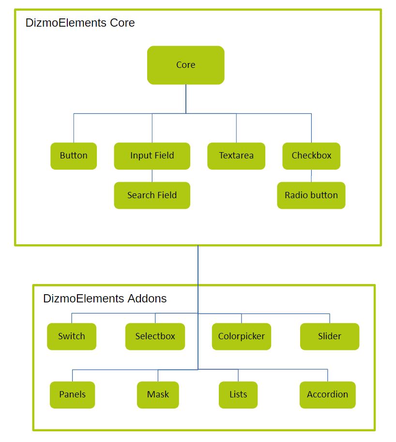
Core Module
The core module provides base styling for the dizmo (background, font color, etc.) and classes for colors, sizes and other attributes. Other than the very basic styling, it does not provide much more and does not change the DOM tree in any way. As such it is always the very first element to be loaded and is provided by the viewer as the first item in the DizmoElements Core set.
DizmoElements Core Set
The core set consists of a base of the Core Module and a set of basic Modules that provide the “look and feel” of dizmo without the developer doing anything. This is important, as we want dizmos to look uniform and it is the only way to achieve a decent theming inside the viewer. All modules in the Core set make use of the Core Module and the provided classes. Furthermore are all modules in the core set written in plain JavaScript without the use of external libraries. Most of the modules in the core set will not change the DOM tree (exceptions are Checkbox and Radiobutton) and will seamlessly integrate into any application written by a developer. It’s important to note here that the developer of a dizmo should NOT be aware of any of this happening. The magic happens quickly and inherently through CSS and does not require any calls from the developer. All the events triggered for these elements are the default HTML events and don’t require the developer to know anything about DizmoElements.
Modules
Please refer to the individual modules for more information on available functions and options.