The importance of On Demand Dashboards in Industrie 4.0
Wrench Time, Time to First Oil, First-Time Fix Rate. These are just some examples of the time-led, outcome-led KPIs that we were hearing all about last week on the Everis stand at the IoT Solutions World Congress in Barcelona.
Such KPIs are examples of the outcome economy – the hallmark of the Industrial IoT – and it was interesting to see first-hand dizmo’s contribution to that as a humanly intuitive data decisioning space.
(Footage of Everis solutions, DSS here and Liquitrax here, in Spanish and in English respectively)
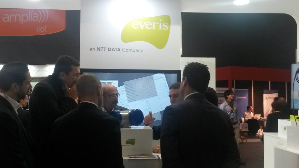
Above: On the fly water contamination data parameters being brought onto the non-hardcoded dizmo surface from Everis’ DSS solution.
Two observations were immediately striking. Firstly, probably entirely without exception, every single user interface in the congress hall was the static, legacy, one app workspace, with tab views, and limited to the hard-coded visual that IT had programmed three-six months ago when they made the mash-up.
Tabs are, by definition, exclusive visualisations (when you click on tab two, you exclude the visual of tab one). It is truly essential to be able to have all the core data points visible in front of the eye – a single pane of truth, if you like – limiting “to and fro” clicking, fatigue and click friction.
Static interfaces limit the opportunity for “data digging”, actually interacting with the data, and self-service dash-boarding, the self-service creation of insight.
The combination of human eye and brain is still far superior to most analytic and rule-based engines. Let’s, therefore, enable the human see patterns and observe trends by bringing on to this dashboard what he wants when he needs it. If Water Temperature is going up, let me look at Water Content measurement and Flow Velocity side-by-side. Why do I have to click out and in and out again between all three real-time visuals?
Why are we still stuck with these WYSIWYG (What You See Is What You Get) dashboards? With the crazy amount of data out there, let’s let the human decide how to bring the right data to the surface in an On Demand way.
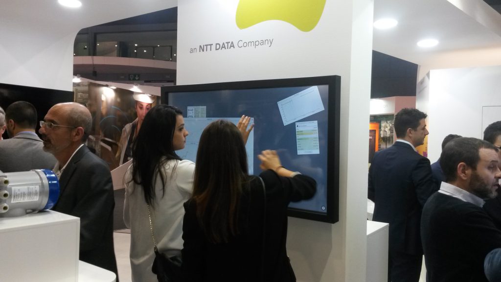
Above: playing with Everis’ Liquitrax; Millennials are now the largest population in the workforce
The second observation is that few seem yet to take advantage of natural interfaces – identified by Gartner, IDC and more as one of the key “Accelerators” in the Third Platform Transformation Theory.
Data will be consumed better if the interface is naturally intuitive: that you move and arrange your things in your digital space in a very natural way – just like you would with letters and paper on your desk, or where you modularly surface the data and information you need when you need it (Ned Kock – Media Naturalness Theory, 2005).
At the same rate, though, how stuck are we with legacy, PC era visualisation paradigms of folders, files and menu options? Even if it’s beneficial, how resistant to change will we be?
Well, that might not be so much of an obstacle to progressive change after all. Millenials are now the largest population segment in the workforce. Unlike dinosaurs like myself, we note that they are “digitally native”, that they have grown up with computers. Is this the demographic that will mostly quickly embrace natural interfaces?
We’re always welcome to ideas, so if you have any comments, feel free to get in touch with us via our website, or using #dizmonks on Twitter. Looking forward to continuing our journey with Everis to build the world’s first truly On Demand Dashboards.
I see your point re: millennials, yet this demographic is not seen as much in decision making positions like the ones who would need to be privy to the data showcased on these dizmos (excluding silicon valley, of course).
Although the millennials could be your foot in the door, I imagine the target audience for this application (and the ones who would foot the bill) to be consultants and mid/high decision makers who need a large influx of data to execute a tasks.
So don’t discard “dinosaurs” just yet – your UI/UX still needs to ease their mind enough for them to pay the service ;-)
Well, yes, correct: there needs to be a concrete ROI or some meaningful value being created for execs, consultants and decision-makers to invest in these nextGen UI/UX techniques. Aside from being engaging, it has to be useful – generate some desired “outcome” and not just visibly engaging for engagement’s sake.
What we saw again in this conference was everyone is still highly focused on the back-end. No-one is talking about the front-end. In this sense, the friction-free, infinitely expandable, On Demand Dashboard for better data discovery in a more humanly intuitive way is a necessary part of the ecosystem.
Your back-end may be robust, resilient, powerful and precise. But if your visual communication of that data gets in the way ofyou slickly travelling those last few metres of the journey from data generation to decision, then your “desired outcome” is negatively affected.